Part One:
- IN YOUR SKETCHBOOK: Make a list of at least three contrasting concepts for each side of the diorama. Examples of simple solutions (you will create better ones!)
- Day & night
- Arctic & desert
- Curvilinear & angular
- Using one page for each concept, rough sketch at least one set of compositions for each concept. You will choose one of these to develop into the final.
I had many rough ideas, but each one seemed to overcomplicate the piece. I ended up working with my ideas in the bottom left image, with a few alterations.
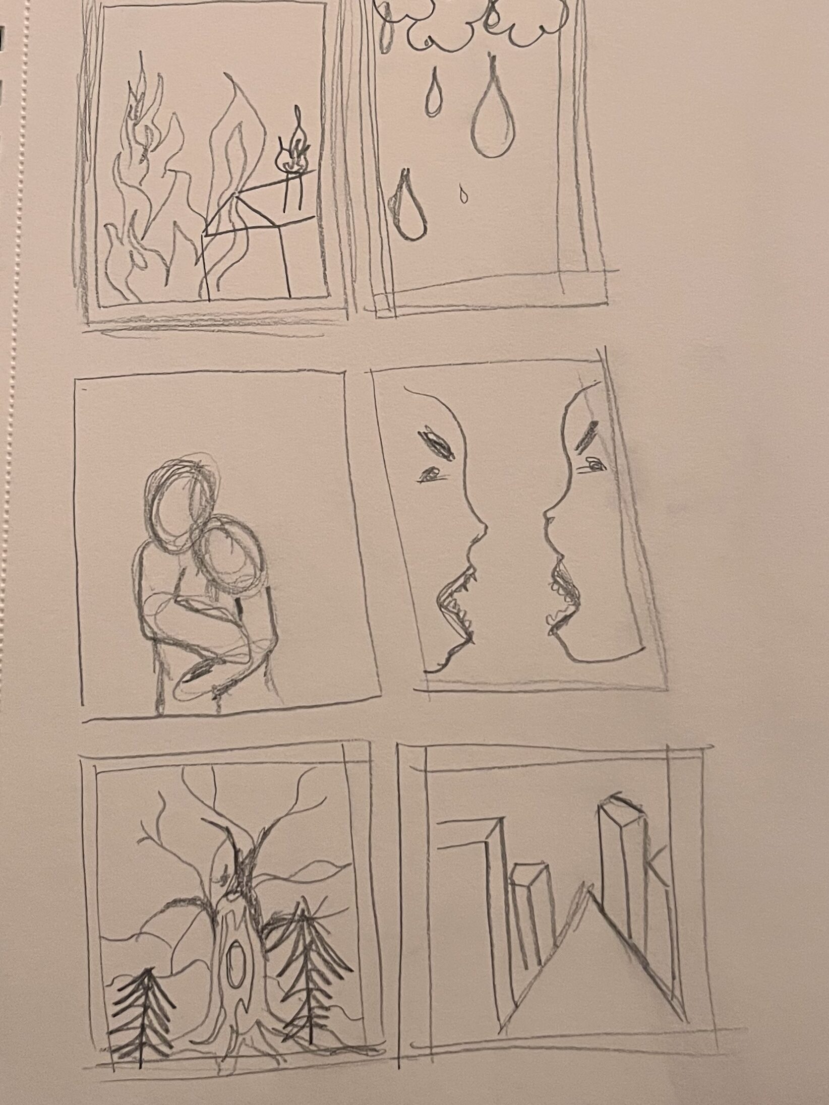
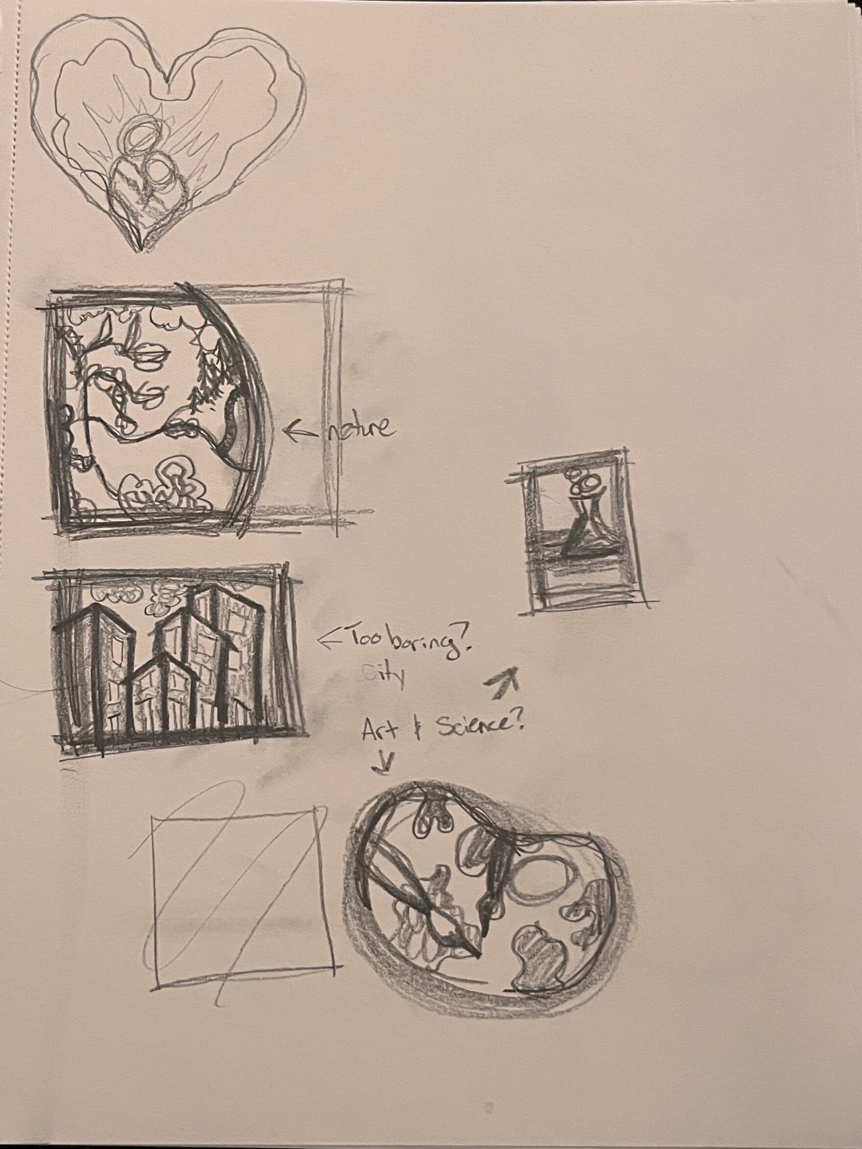
Part Two: From your contrasting ideas select objects that relate and think of them in layers.
- What do you want to represent in this contrast for the viewer?
- Take the images and break them into three or more layers (on each side), by distance (foreground, midground, background). The composition should be visually dynamic. Consider scale, overlapping, foreshortening and perspective (Think back to our Dynamic Drawing project!).
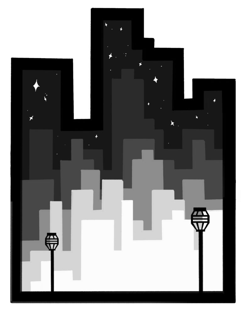
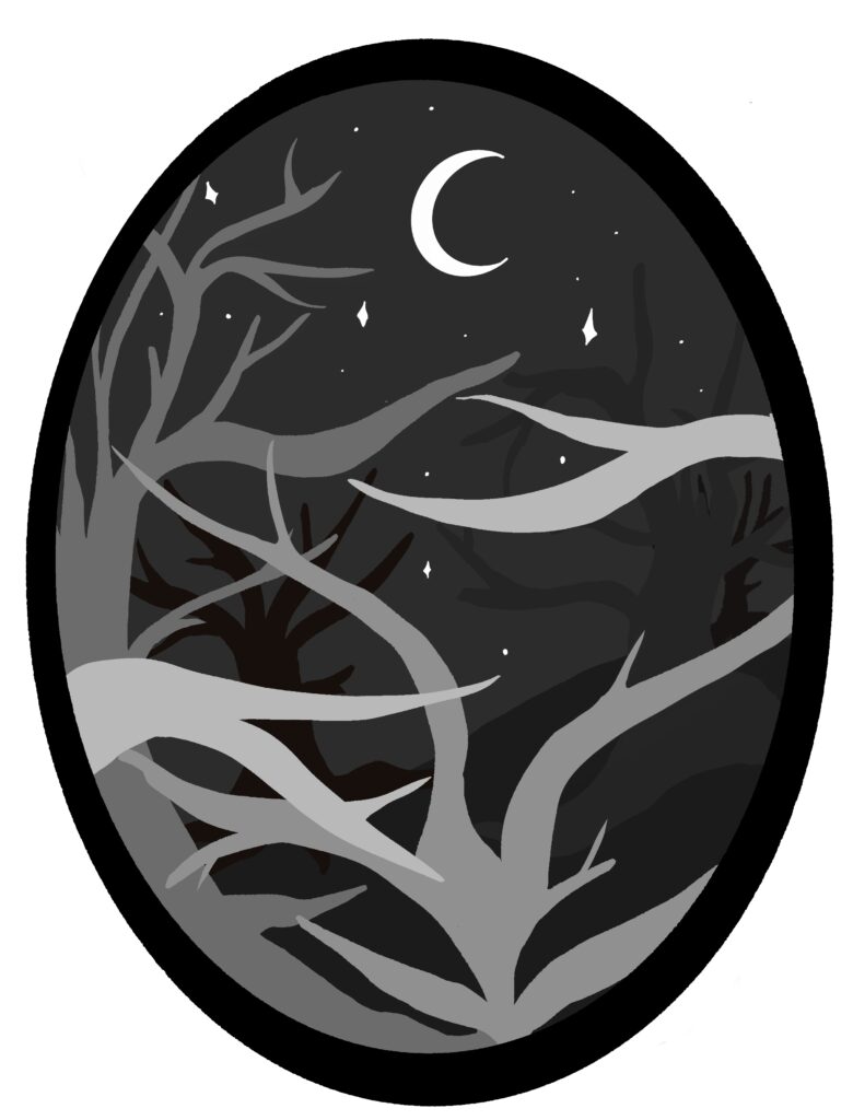
The Digital forms were much darker than the cut out pieces, and for some reason I reversed the value differences. I am fond of both, but I believe the final work is stronger than the digital designs.
Part Three: Digital Translation
- Transfer sketches in sketchbook to digital files. We will go over this in class and we will be using the Mac Lab to do this. You will create a digital layer for each of your lasercut layers. These will be saved imported into Lightburn,Links to an external site. cut the layers. We will go over this in class and in the Makerspace.
- Create a cut layer for the frame of the piece (sides and front).
- Schedule time in the Makerspace to cut your layers with supervision – if you can’t do it during class time.
- When all of your layers are cut, paint them with acrylic paint to accentuate depth. Think about the role color value plays in creating depth.
- Neatly assemble the layers using hot glue.
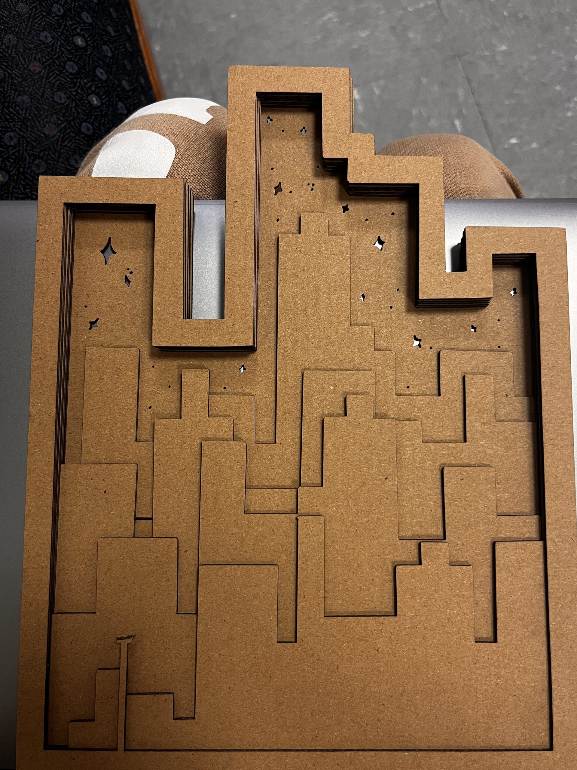
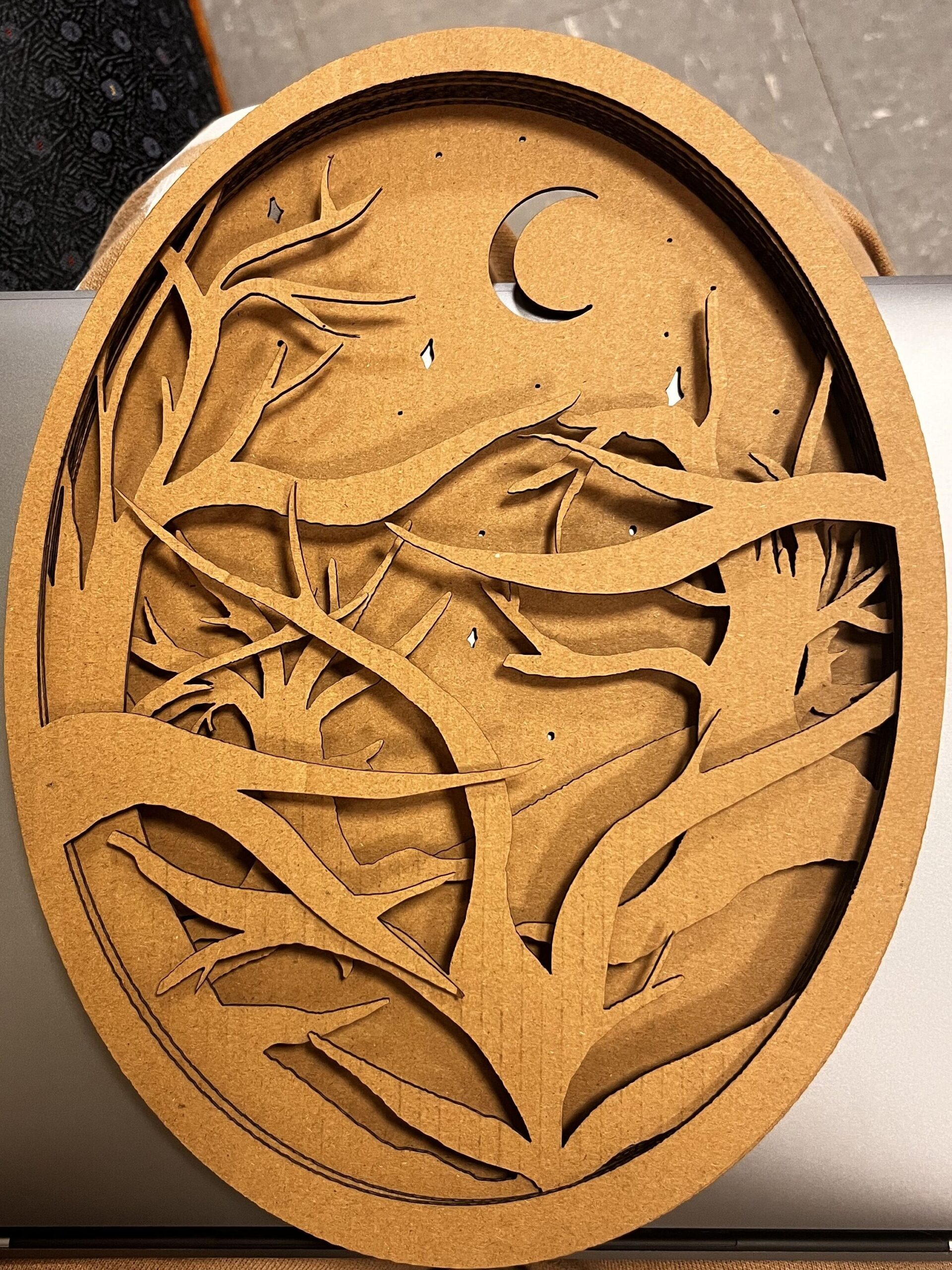
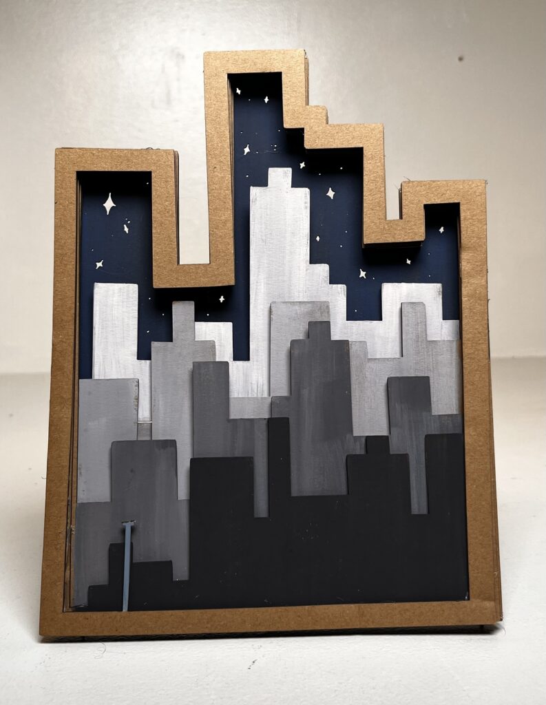
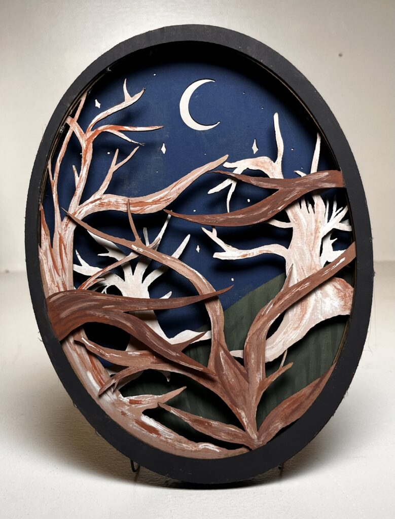
“Late Nights and City Lights” – Ellie Adams
This project had many challenges, I had never really worked with a laser cutter before, and had a lot of hesitation when it came to that step. Some of the small details were erased and a light post I made turned into a telephone pole. Not ideal, but just enough detail to keep it in the piece.
Another small mistake of mine was making the two designs drastically different shapes. The intent was for them to be back to back for a full 3D effect. Although my design does not sit like that, I still believe it achieves the overall concept of the assignment.
The actual drawings I went with were very simple forms. One design had flat and sharp geometric shapes, whilst the other was filled with flowing organic structures. I intentionally used dark to light values on both the city buildings and the trees to add a layer of depth.
There is a lot of texture on the trees to resemble natural bark, and the buildings are smooth grey tones to show a manmade structure. Between the color, form, texture, and detail they are very contrasting pieces. Yet when you look at them together it’s as if they were meant to be seen together.
Leave a Reply